The McDonald’s Big Arch burger has likely gotten even more than McDonald’s has been expecting, albeit via the less than flattering reaction to a now viral tasting of the new product by CEO Chris Kempczinski. Its posting has drawn many online and media commentaries centered around his timidness in eating the Big Arch, but it’s clear that awareness of the new “product” itself has become impressively high as a result.
Upon hearing about it, I personally was intrigued by its hefty size and hefty price tag compared to most McDonald’s offerings. So I set out to see just how it stacked up, both literally and macronutritionally, against similar double cheeseburgers that they offer. I hope you enjoy the product of that curiosity.
Data
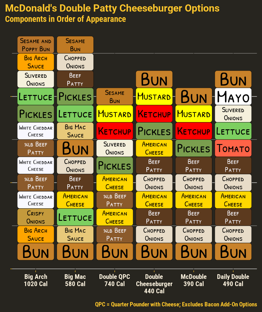
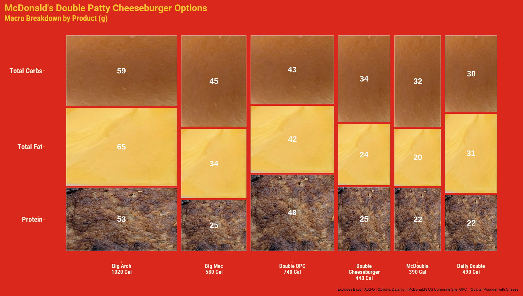
Data on ingredients and their placement, and on nutritional values were taken from the McDonald’s US corporate website.
Visualizations
Brief Notes
The plot of ingredients was more to explore shape and text formatting with ggplot and related packages, and I think the result definitely does the job it was built for.
The macronutrient plot was more a test to see how well this format simultaneously allowed for quick comparison of the differences in proportions between the different products, and how the overall total weights for each differ between the products. With this many products, I think it performs much better for the former than the latter. I actually needed the wider proportions to emphasize the totals more, since it looked a bit even harder to differentiate in a plot of equal height and weight. A stacked bar chart could also do the job, but has its own shortcomings that make it less of a straightforward choice depending on variability in the totals and the number of items and categories being compared. It just seems best to assess which is the better choice on a case-by-case basis.